Substack Logo Size Guide 2026: A Clean 256px Mark
Make a clean Substack logo with the right 256px square, transparent background, and a separate wordmark that doesn't get squeezed.

Contents
For a Substack publication logo, export a transparent square that is at least 256 x 256 pixels. Keep the mark centered with breathing room, and make a separate horizontal wordmark if your publication name needs to appear in the header. The common mistake is treating those two assets as one file, then shrinking a readable name into a tiny square.
The Substack asset map
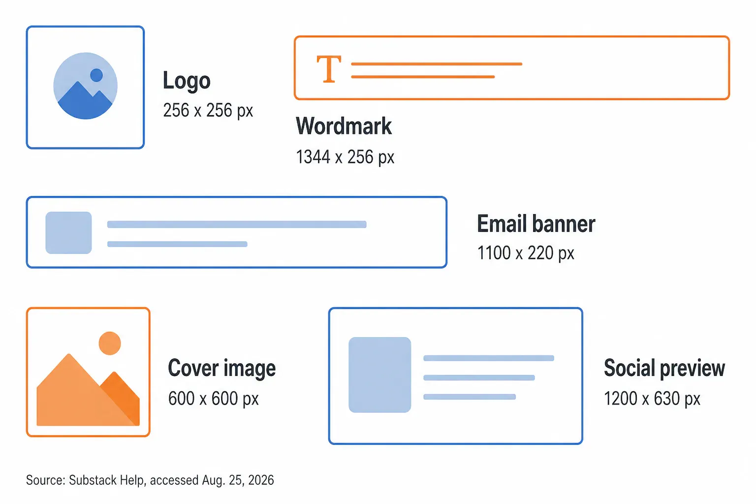
Substack’s own guidance splits its publication assets by job. A logo needs a transparent square at least 256 x 256 pixels, while a wordmark needs a horizontal image at least 1344 x 256 pixels. That difference matters more than chasing a larger number: one is a compact mark, the other is a line of type that needs room to breathe.
| Asset | Official minimum or recommendation | Practical job |
|---|---|---|
| Logo | 256 x 256 px, transparent background | Square publication mark |
| Wordmark | 1344 x 256 px | Horizontal publication name |
| Email banner | 1100 x 220 px, transparent background | Header graphic in email |
| Cover image | 600 x 600 px | Publication cover art |
| Social preview | 1200 x 630 px, 14:10 ratio | Shared post preview |
Those are not interchangeable slots. Substack’s image guide also says that a full-width image taller than a 1:1 ratio is automatically cropped to 1:1. A square logo can survive that kind of system. A long title lockup usually cannot.
The useful rule is blunt: make the logo recognizable without its name. If the letters are the identity, export them as the wordmark instead. At a small header size, cramped kerning is more noticeable than a plain mark.
Logo and wordmark roles
A logo is the small visual shorthand. A wordmark is the publication name as a designed horizontal asset. Substack’s theme documentation explicitly gives each one a different minimum, 256 x 256 for the logo and 1344 x 256 for the wordmark, and lets you choose how the name or wordmark appears in the homepage header.
That creates a clean production split:
- Build a square logo master with only the symbol, monogram, or simple badge.
- Build a second, horizontal file for the full publication name.
- Keep both files on transparent backgrounds when the page color may change.
- Upload the logo and wordmark to their intended fields, rather than using a cropped banner as a logo.
Substack’s custom-theme guide calls the horizontal asset a wordmark and places it in the header controls. That is the clue most quick size lists miss. The 1344 x 256 file is not an oversized version of the 256 x 256 logo; its wide canvas protects the name’s visual hierarchy.
Native Mac preparation
If your logo is already a clean square and only has a plain background to remove, start in Preview on a Mac. It is already there, and it avoids opening another editor for a one-off cleanup. Duplicate the original first, open the copy, use Remove Background, and keep the PNG conversion when Preview offers it.
Apple documents that exact route and the copy-first precaution in its Preview background-removal instructions. Preview is good at the boring version of this task: a clear, flat mark on a contrasting background. It starts to wobble around fine outlines, paper texture, or a photographed logo with shadows. Those are edge problems, not size problems.
Do not make a circular crop just because the logo sits in a small square. A circle throws away the corners and turns a rectangular badge into a different mark. Microsoft 365’s Crop to Shape feature makes the trade-off visible: Fill crops outer edges, while Fit can leave space around the image. That is useful for a deliberately round emblem, but it is the wrong reflex for a Substack wordmark.
Square masters and browser tools
Start with a square master even if you expect the final header to display smaller. The source does not need to be exactly 256 x 256. It only needs to remain square, transparent, and comfortably above Substack’s floor. A 512 x 512 master is a sensible working file because it is exactly twice the stated minimum, which leaves room for a later crop without inventing detail.
When the problem is framing, use RoundCut Crop to lock a 1:1 rectangle and move the design inside it. RoundCut’s crop page supports rectangular crops and local browser processing, so the operation stays focused on the canvas rather than a pile of editor controls. The trade-off is that a crop can’t repair a fuzzy raster logo; it only decides what remains visible.
This is where I disagree with the usual “make it a circle” advice. Circles work for avatars because the destination applies a round frame. Substack’s official logo requirement is a transparent square, not a circle. If your brand already has a circular seal, fine, preserve it inside the square. If it has a wide symbol, do not force it into a circle merely to make it feel like a profile picture.
For a photographed drawing or a logo on white paper, RoundCut Background Remover is the faster second route. Inspect the thin strokes afterward. RoundCut’s background remover can return a transparent PNG, but its own tool guidance flags clear glass, thin backlit fabric, and pale-on-pale subjects as hard cases. Fine serif terminals can deserve the same skepticism.
Transparent edges and file format
Transparency is not decoration here. It lets the square logo sit on a light header, a dark header, or a color block without a white rectangle announcing the file boundary. That is why Substack specifies a transparent background for its logo and email-banner recommendations.
Keep the master as PNG when the mark needs transparent pixels. JPG is a poor fit because it flattens that empty area into a solid background. WebP can be useful on a website, but the safest handoff for this specific publication asset is the PNG Substack asks you to prepare. This walkthrough has a more detailed cleanup sequence if the source came from a scan or a screenshot.
There is a cost. A transparent PNG can be heavier than a simple photo export, especially when the source includes an oversized canvas or noisy pixels around the edge. Trim unused transparent area before you compress. If the file is still awkwardly large, keep a PNG light rather than converting the only transparent master into a JPG.
The simple test is to place the finished file over black, white, and your chosen accent color. A stray white fringe becomes obvious immediately. Run that test before upload, not after you have adjusted the homepage typography around it.
One more detail matters on a mark with a thin outline: judge it at the header’s small display size, not only at 400% zoom. A hairline that looks elegant in a large design file can vanish once the browser scales the logo down. That’s a contrast problem (not a reason to add a drop shadow). If the line disappears, give it more weight in the master or simplify the shape. Don’t keep exporting larger files in the hope that pixels will solve a bad small-size decision.
Website editor checks
In Substack, open the Website editor from the publication dashboard and look at the header settings. Upload the square mark to the logo slot. Upload the long name only as the wordmark. Then preview the header layouts before treating the first view as final.
Three checks catch most avoidable failures. You’re looking for reading problems, not a pixel-perfect replica of the editor canvas:
- Small-size read: View the logo at its smallest header treatment. If the tiny detail disappears, simplify the mark rather than making the file larger.
- Header contrast: Try the background and accent colors you actually plan to use. Transparency only helps if the remaining strokes still have contrast.
- Name treatment: Check the wordmark in the selected header layout. A full publication name needs its horizontal canvas; a logo slot is not a rescue lane for it.
Substack lets you resize a wordmark by dragging its corners, according to its theme guide. That control is for refining a good horizontal file, not for rescuing letters that started packed into a 256-pixel square. The distinction saves a surprising amount of re-exporting. It’s also why a short publication name can still benefit from the wordmark slot: the header has room for type, while the square logo can keep its silhouette clear.
Common asset mix-ups
The most expensive mistake is designing for the upload field instead of the viewing context. A large file can still read badly if its central mark is tiny, its whitespace is uneven, or its type is trying to do two jobs at once. We’ve all seen the version where the publication name becomes a gray blur in a browser tab.
Watch for these specific mix-ups:
- The banner-as-logo swap: An 1100 x 220 email banner belongs to email, not the square logo slot. Its wide composition collapses when reduced.
- The wordmark-in-a-badge trap: A 1344 x 256 wordmark has a 5.25:1 canvas. Treating it as a 1:1 logo requires discarding most of what makes it readable.
- The opaque export: A white background may look harmless in an editor, then clashes once the header color changes.
- The social-preview substitute: A 1200 x 630 preview is for sharing a post. It is not the publication logo, even when it contains the same colors and type.
For other small-brand placements, compare the email logo sizing guide before reusing the Substack export. The two uses can share a visual system without sharing one file. That separation is less glamorous than a new logo treatment, but it prevents a common brand-system failure: the same mark gets stretched, squeezed, and rasterized for five unrelated containers until none of them feels intentional.
Related dimensions kept separate
Substack’s 600 x 600 cover image, 1100 x 220 email banner, and 1200 x 630 social preview each support a different comp. Build them from the same colors, type weight, and mark, then let each canvas do its own job. Reusing the exact same image everywhere is how a clean identity turns into a cramped set of thumbnails.
If an email banner becomes unexpectedly heavy, shrink the export after you have settled the crop and dimensions. Compression is the last pass because it reduces file weight, not framing. The square transparent logo should stay a PNG master; the wide banner is where a lighter delivery format is more likely to make sense.
Keep a 512 x 512 transparent master for the logo, a 1344 x 256 wordmark for the publication name, and separate files for the remaining slots. That small folder structure respects Substack’s dimensions and leaves your mark intact when the header design changes (and makes the next redesign much less fragile).


