Logo Avatars: the Pixel Size Where a Wordmark Fades
A nine-letter wordmark keeps solid ink down to a 52-pixel avatar, a stacked lockup needs 72 and a monogram holds at 18. Measured, with the rule behind it.

Contents
A nine-letter wordmark stops printing solid black below a 52-pixel avatar. Put the same wordmark under an icon and the floor climbs to 72 pixels. A two-letter monogram holds down to 18. I measured all three on the same white plate, and the first thing that breaks is not sharpness. The strokes go grey, because a stem thinner than one destination pixel can never reach full ink.
Shrink your own file before you redraw it
The cheapest test is already installed. On a Mac, Apple’s Preview guide says to click the Adjust Size button, then “Enter new values for width and height”. Windows does the same job in Paint, which Microsoft documents as resizing “in pixels or as a percentage of the original size”. Type 48 into the width field, save a copy next to the original, and you have the file the platform will actually draw.
Then the trouble starts. Preview shows that 48-pixel copy at whatever zoom the window happens to be using, so on a 27-inch display you end up inspecting a magnified thumbnail instead of a thumbnail. Neither app puts the circular mask over it either, so you’re judging corners that nobody will ever see. A browser-based circle crop gives you the round version and the small version in one pass, without the file leaving your machine.
The sizes a product actually renders
Design systems publish this and almost nobody reads it. GitLab’s Pajamas documentation lists its avatar sizes as 16, 24, 32, 48, 64 and 96 pixels, and adds one honest line: “The size of an avatar varies depending upon its context.” So the same file gets drawn six different ways inside one product, and the 512-pixel square you uploaded is only the raw material (which makes the upload spec and the render size two separate problems, solved separately).
Gravatar, which fronts avatars on comment threads and CMS profiles across the web, serves 80 by 80 when nobody asks for a size, with anything from 1px up to 2048px available on request. Eighty pixels sounds generous until you see where the ink starts failing.
Screen density splits the verdict further. MDN describes devicePixelRatio as the ratio of physical pixels to CSS pixels, with 1 on a classic 96 DPI display, 2 on HiDPI and Retina screens, and often more than 2 on phones. Your 24-pixel avatar slot gets 48 real pixels on the phone in your hand and 24 on the old monitor at the client’s front desk. That’s why the mark you approved on your phone can look like a smudge in someone else’s sidebar, and why a bigger upload helps less than people hope: past a point, the platform is throwing away everything you sent.
Three marks, five sizes, one bench
So I built the test instead of guessing at it. Three synthetic marks, each drawn in bold sans on a 1024-pixel white circular plate, the shape a circular export produces:
- Plain wordmark: a nine-letter name across 72% of the plate. Stem width on the artwork, 17 pixels.
- Stacked lockup: a rounded-square mark above a smaller wordmark, the layout most small businesses upload (which also makes the type the thinnest thing in the circle). Stem width, 11 pixels.
- Two-letter monogram: 52-pixel stems, nothing else in the circle.
Each went down to 96, 64, 48, 32 and 24 pixels with Lanczos resampling. At every size I read the darkest luminance inside the lettering band and scored it against the white plate with the standard contrast formula.
| Mark | 96 px | 64 px | 48 px | 32 px | 24 px |
|---|---|---|---|---|---|
| Plain wordmark | 21.0:1 | 21.0:1 | 13.58:1 | 8.19:1 | 4.42:1 |
| Stacked lockup | 19.44:1 | 14.55:1 | 10.21:1 | 4.74:1 | 3.90:1 |
| Monogram | 21.0:1 | 21.0:1 | 21.0:1 | 21.0:1 | 20.26:1 |
The monogram barely moves. The stacked lockup drops from 19.44:1 to 4.74:1 between 96 and 32 pixels, and its darkest pixel at 24 measures 129 out of 255, which is not dark grey. It is the grey of a disabled button.
Why the ink fades before the letters blur
Sweeping the sizes in 2-pixel steps found the exact floors. The plain wordmark holds solid ink down to 52 pixels, the stacked lockup down to 72, the monogram down to 18.
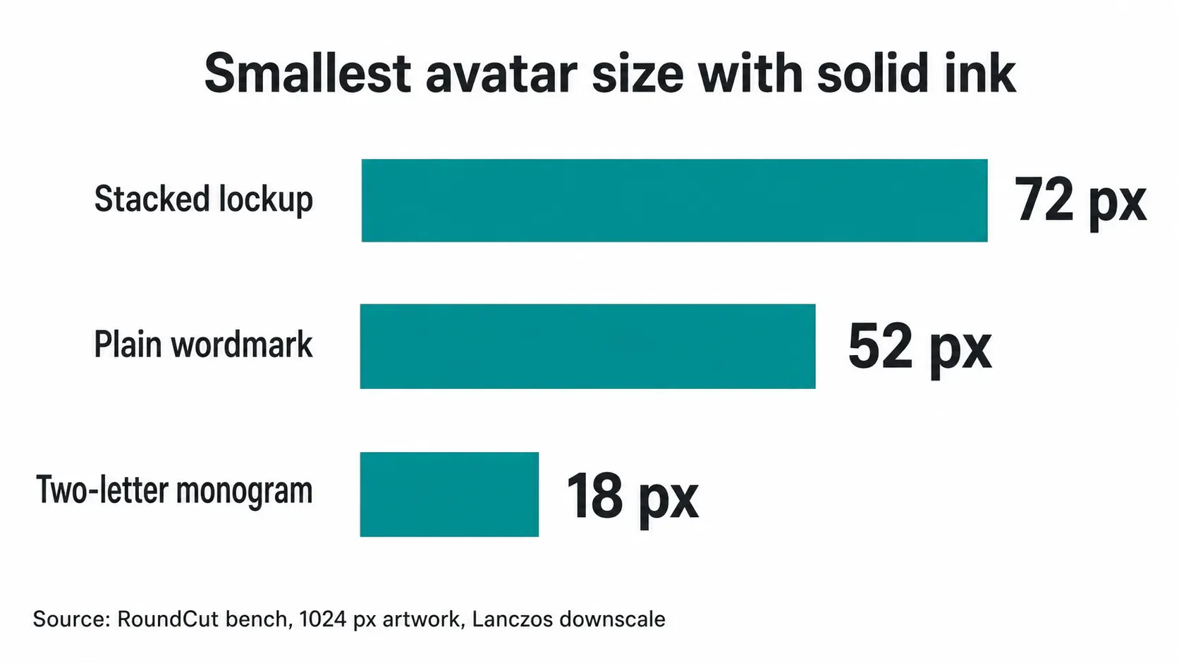
The mechanism is arithmetic, not aesthetics. A stem 11 pixels wide on a 1024-pixel plate lands on 0.52 of a pixel at 48, and a single pixel cannot be half-covered in black, so the resampler averages ink with plate and writes mid-grey. Cap height collapses on the same schedule: 2.53 pixels tall at 48, 1.27 at 24. Nothing is blurred at that point, every edge is exactly where it belongs, and the letters have simply stopped being dark enough to register as letters.
That gives a rule you can apply to any artwork without running anything. Divide the stem width by the artwork’s width, and it needs to be at least 1 divided by the target size. On a 1024-pixel export that means a 21-pixel stem to survive 48 pixels and a 43-pixel stem to survive 24. The two lettered marks on my bench sat at 1.7% and 1.1% of the plate, weights that read comfortably at 96 and are finished by 32.
The 4.5:1 ruler that skips logos
Here the numbers meet a standard that declines to help. The W3C’s contrast minimum asks for 4.5:1 on normal text and 3:1 on large text, then carves out an exception in one sentence: “Text that is part of a logo or brand name has no contrast requirement.” My stacked lockup measures 4.74:1 at 32 pixels and 3.90:1 at 24. As body copy it would fail an accessibility audit at the smaller size. As a logo it passes every audit ever run on it, which is exactly why this defect ships.
I’ll take the position the standard won’t: if your lettering can’t clear 4.5:1 at the size a platform renders, treat it as broken and change the file. The cost of being wrong is a redraw. The cost of being right and doing nothing is a brand that reads as a grey smudge in every comment thread for two years.
Nielsen Norman Group reached the qualitative version of this back in 2014, writing that intricate details are difficult to distinguish at smaller sizes and that icons should stay simple and schematic. The same article argues for a visible text label beside the icon, which is worth remembering before you fight to keep letters inside the circle. The platform already prints your name next to the avatar.
What to upload instead
Three fixes, in the order I’d try them:
- Ship the monogram. Two letters at 52-pixel stems held 20.26:1 at 24 pixels, the widest margin of anything I measured. You lose the full name, which is the whole reason someone put a wordmark in a circle to begin with.
- Crop to the symbol. If the lockup has a mark above the type, cut the type and let the symbol fill the plate. Works when the symbol carries recognition on its own, fails for the many small brands whose symbol is a generic geometric shape.
- Redraw heavier and shorter. Double the stem on that lockup and it lands at 22 pixels of artwork, over the 21-pixel line for a 48-pixel render. Budget a designer’s afternoon, and expect the result to look nothing like the letterhead.
Whichever you pick, export it square and oversized, then let the platform downscale once instead of twice. Prepping a transparent logo edge first keeps the plate from fighting the mask, and if the mark has to sit inside a round frame, the rules for a logo inside the circle still apply. Start from a square source at 512 or 1024 pixels, then check the result with RoundCut Resize at 48 and 24 pixels before you upload anything. Same test applies to signature logos, which live at similar sizes in a very unforgiving box.
One caveat on my own numbers. Contrast is not legibility, and letters mush into each other well before the ink fades, so every floor above is optimistic rather than a pass mark. Lanczos is also a generous resampler; a platform running something cheaper will break your wordmark earlier than 52 pixels, and it won’t tell you when it does.


