Why Colored Text Blurs in JPEG (Black Text Doesn't)
Red headlines fringe as JPG while black text stays crisp. I measured both at quality 85, plus the formats that fix it without doubling your file size.

Contents
JPEG keeps every brightness sample and throws away three of every four color samples. Black text lives in the brightness channel, so it comes through clean. Colored text gets rebuilt from a quarter of the data, and every edge picks up a fringe. On one promo card at quality 85, 6.75% of the pixels in the red headline came back visibly wrong. The black line measured zero.
The pattern repeats on every project with a colored headline in it. The type looks crisp in the design tool, you export a JPG for the client, and at 200% zoom a magenta-and-cyan halo sits hugging every letter. Bump the quality slider, re-export, and the halo mostly stays. That is the part people find maddening, and it is also the part with a real explanation.
Save a PNG in the Editor You Already Have
The fix that needs no new software: export as PNG instead of JPEG. Apple lists PNG among the formats Preview supports on macOS, and Microsoft Paint has saved to .png by default since Windows 7, having shipped JPEG as the default back in the Vista version. Neither app asks you anything about color sampling, and neither one has to, because PNG does not subsample.
That route runs out in two places. Neither editor exposes a subsampling control, so when an upload form accepts JPEG only, saving from Preview or Paint hands you the same fringe. And a PNG straight out of a design tool usually carries more weight than the artwork needs, which is the moment to shrink the PNG itself rather than reach for a lossy format.
If the artwork is going on the web anyway, the better move is to export it as lossless WebP instead. I’ll get to the numbers on that below, and they are lopsided enough to end the argument.
What JPEG Actually Throws Away
Your eyes are the reason this format exists in its current shape. Wikipedia’s reference on the topic puts it plainly: the human vision system processes color at about a third of the resolution of lightness. JPEG exploits that. It splits the image into one brightness channel and two color channels, then samples color at quarter resolution by shrinking both color channels by a factor of 2 horizontally and vertically. That mode is called 4:2:0.
Codec author Nigel Tao lays out the arithmetic in his write-up on chroma upsampling: an 800×600 image keeps 800×600 brightness values but only 400×300 for each color channel. The full-color version would hold 1,440,000 values. After subsampling you are storing 720,000, before any of JPEG’s other compression stages touch the file. Half the data, free, on a photograph.
Nobody chose this. It is the default: the reference encoder’s default sampling level is 2×2, documented as 4:2:0, and switching it off is an explicit flag rather than a slider. Your design tool exports through some encoder, that encoder does what it always does, and the setting has no name anywhere in the interface you actually touch (which is why the fringe reads as a mystery instead of a checkbox).
The damage lands in a specific place. Wikipedia’s summary is that degradation is more noticeable “where colors change abruptly”, which is a technical way of describing the counter-form of a letter, the edge of a logo, or the boundary of a colored button in a screenshot. A photograph almost never changes color abruptly. A promo card does it thousands of times.
One Card, One Setting Changed
To get numbers instead of impressions, I rendered a promo card at 1200×630: four headline lines in red, blue, green and near-black, plus a round brand mark. I saved it to a lossless master, then encoded that master twice at quality 85, changing exactly one thing between the two runs, and compared every pixel against the master. A pixel counts as visibly off when its worst channel drifts more than 30 levels out of 255.
| Headline color | Color kept (4:4:4) | Color subsampled (4:2:0) | Worst deviation, subsampled |
|---|---|---|---|
| Red | 0.13% | 6.75% | 97 |
| Blue | 0.48% | 6.56% | 88 |
| Green | 0.31% | 5.58% | 72 |
| Near-black | 0.00% | 0.00% | 26 |
The black line is the finding, and it is not a question of degree. Same worst deviation of 26 in both files, zero pixels visibly off in either. Black on white is almost pure brightness information (which is precisely the channel JPEG protects), so the color channels have nothing much to lose. Red, blue and green lines in the same file, same encoder, same quality, gave up 13× to 50× more pixels.
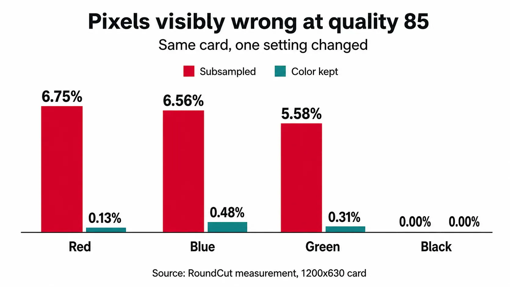
Keeping the color cost bytes, and it is worth knowing how many before you decide: the subsampled card came in at 51.6 KB, the full-color version at 67.8 KB. That is 16.6 KB more, a 31.4% surcharge for a card that finally matches the comp. Whether the trade is worth it depends entirely on what sits in the frame, which is the next question.
Why Raising the Quality Doesn’t Help
Short version: it does not, and the file punishes you for trying. Holding subsampling on and walking the quality slider up the range, the fringe flattens out almost immediately while the file keeps growing.
| Encode | File size | Red line visibly off |
|---|---|---|
| Quality 60, subsampled | 34.6 KB | 10.47% |
| Quality 85, subsampled | 51.6 KB | 6.75% |
| Quality 95, subsampled | 74.7 KB | 6.08% |
| Quality 60, color kept | 45.1 KB | 3.17% |
| Quality 95, color kept | 100.4 KB | 0.00% |
Going from quality 60 to quality 95 more than doubles the file, 34.6 KB up to 74.7 KB, and buys a drop from 10.47% to 6.08%. Meanwhile quality 60 with the color kept beats quality 95 with it thrown away, at 45.1 KB against 74.7 KB. You are paying 30 KB for a worse-looking headline.
One honest reason the folk advice survives is Photoshop. Its export presets stop subsampling on their own at Save For Web quality 51 and above, and at quality 7 and above in Save As. So a designer who nudges the slider from 45 to 60 in Photoshop really does watch the fringe vanish, then passes the tip along to someone whose tool subsamples at every setting, where the same nudge does nothing but add kilobytes.
Small Type Takes the Worst of It
The bleed itself is shallow. Measuring outward from the edge of each letter on the subsampled card, 6.53% of the pixels one pixel outside the glyph are visibly wrong, with the worst channel off by 55. Two pixels out, it is already 0.00%. Background more than ten pixels from any ink came back untouched.
A one-pixel halo is a rounding error on a poster headline and a catastrophe on caption type, because the ratio of contaminated edge to actual letter changes with the point size. Same red, same encoder, same quality 85:
| Text size | Subsampled | Color kept |
|---|---|---|
| 14 px | 12.98% | 0.41% |
| 20 px | 10.17% | 0.35% |
| 28 px | 7.59% | 0.23% |
| 40 px | 6.31% | 0.18% |
| 56 px | 4.83% | 0.12% |
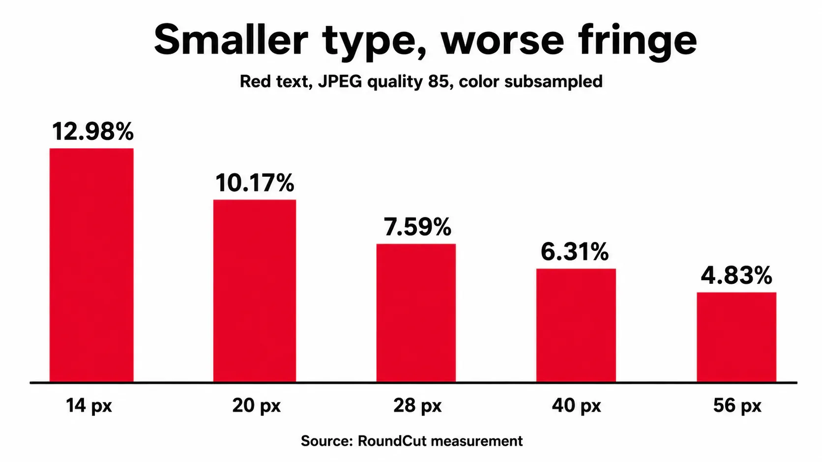
Caption-sized red type loses 12.98% of its pixels, 2.7× the damage the 56 px headline takes. This is why the problem shows up first in the places you’d least expect to check: the legal line at the bottom of a banner, the price under a product shot, the small colored labels in a diagram. The same physics hit anyone compressing a screenshot with text full of colored UI chrome.
What to Ship Instead
For artwork with type in it, skip JPEG. MDN spells this out for screenshots, warning that text easily becomes fuzzy and unclear under lossy compression and pointing at lossless formats instead. My card agrees, and the sizes are not close:
| Format | File size | Red line visibly off |
|---|---|---|
| WebP, lossless | 16.3 KB | 0.00% |
| PNG | 38.5 KB | 0.00% |
| JPEG q85, subsampled | 51.6 KB | 6.75% |
| JPEG q95, subsampled | 74.7 KB | 6.08% |
| WebP q85, lossy | 24.8 KB | 7.02% |
Lossless WebP took 16.3 KB with zero error, against 74.7 KB for the best-looking JPEG in the set, which still fringes. That is 4.6× smaller and perfect instead of nearly-right. Plain PNG at 38.5 KB already undercuts the quality-85 JPEG. MDN makes the same call for icons, noting PNG is a solid bet while lossless WebP is arguably better compressed, and this card is a data point in that direction.
Watch the mode, though. Lossy WebP subsamples too, and lost 7.02% of the red line, marginally worse than the JPEG it was supposed to replace. “Switch to WebP” only fixes anything when it is the lossless variant, a distinction most export dialogs bury in an advanced panel (which is where most people stop looking). If you’d rather not think about it per file, RoundCut Convert covers the PNG, JPG, WebP and AVIF pairings in one place, and the which format fits which job breakdown is the longer answer.
When the destination genuinely demands JPEG, and marketplaces and old upload forms still do, there is a workable order of operations: keep a lossless master, export the JPEG at high quality, and accept that colored micro-type will fringe, so size that type up or set it in near-black. The same discipline applies to a round logo on a transparent background, where the alpha edge is a second thing JPEG can’t carry, and where flattening turns the transparency black if you don’t pick the fill yourself. Keeping a transparent master around solves both problems at once.
None of this makes 4:2:0 a villain. I ran the identical comparison on a photograph, a market fruit stall from Wikimedia Commons, resampled to 1502 px so the re-encode wouldn’t land back on the original’s own compression grid. Subsampled, it lost 0.08% of its pixels and saved 131 KB, a 24.7% cut. Same setting, roughly 84× less damage than it did on the card, and on that file I’d take the smaller number every time, then run photo compression over it as well. The default is tuned for the thing photographs are made of, gradual color, and your promo card simply is not that.


