How to Make a Twitch Profile Picture That Pops on Dark Mode
Twitch profile picture, measured: why 800×800 beats the conflicting size guides, and the contrast numbers that stop your avatar vanishing on dark mode.

Contents
Your Twitch profile picture is a square JPEG, PNG, or GIF up to 10 MB that the platform displays inside a circle, on a near-black background for every viewer running dark mode. The size guides ranking for this query disagree on dimensions, so upload 800×800 and settle that part. The real failure mode is contrast: I measured a pure-black avatar at 1.26:1 against Twitch’s dark theme. Invisible.
Twitch’s own uploader, in the Creator Dashboard under Settings, then Channel, then Brand, is where the file lands either way. Before it goes there, run the image through a circle crop that shows the mask up front, because the corners you lose are exactly where wide logos die.
The Twitch profile picture spec, per four guides that disagree
Four size guides currently rank for this query, and they hand you three different answers to the same question. Moda recommends 256×256 and claims anything bigger gets downscaled. Hexeum says 512×512. Streamlabs and Mediasizes both say 800×800 or larger. The minimums disagree too: 200×200 per Moda, 256×256 per Mediasizes. They even split on whether the avatar renders as a circle or a full square.
| Guide | Recommended upload | Stated minimum |
|---|---|---|
| Moda | 256×256 | 200×200 |
| Hexeum | 512×512 | not stated |
| Streamlabs | 800×800 | not stated |
| Mediasizes | 800×800 or larger | 256×256 |
The three facts every guide agrees on: square source, 10 MB cap, JPEG, PNG, or GIF. So make the disagreement irrelevant. Upload a sharp 800×800 square, which clears every floor on that table, and let Twitch scale it down instead of scaling a small file up. Mediasizes’ reasoning holds: start big and every smaller rendering the platform makes, from channel page to hover card, inherits the sharpness. A soft source degrades the way a blurry Telegram profile photo does, and for the same reason: the platform re-encodes what you give it.
On the circle question, Mediasizes is the one matching what viewers actually see, and the framing consequence follows: center the subject and let the mask eat only margin.
Twitch’s built-in uploader comes first
You don’t need any external tool to change the picture. Log into Twitch, open the Creator Dashboard, go to Settings, pick Channel, and the Brand tab holds the profile picture slot. Drop the file and confirm. Nothing else is required.
The uploader does the mechanical part fine. What it won’t do is warn you that your mark sits too close to a corner, or that the charcoal background behind your logo just merged with the UI around it. It takes the square you give it, and the first honest preview of the circle happens on your live channel, at thumbnail size, next to a purple follow button. Fixable problems, but only before the upload.
The dark-mode contrast test nobody runs
Twitch’s own extension-design docs spell out both themes: the light UI sits on plain white, and the dark UI sits on a color the docs name Twitch Dark Purple, hex #201c2b. That near-black surface is what a big share of your audience puts behind your face or your logo. None of the four size guides above mentions it.
W3C’s accessibility standard gives us a pass bar: WCAG 2.1 requires 3:1 contrast for non-text elements like icons and graphical objects. An avatar is exactly that kind of object, so I borrowed the bar. I ran seven common avatar colors through the WCAG luminance formula against both documented Twitch backgrounds. The results explain a lot of dead-looking channels.
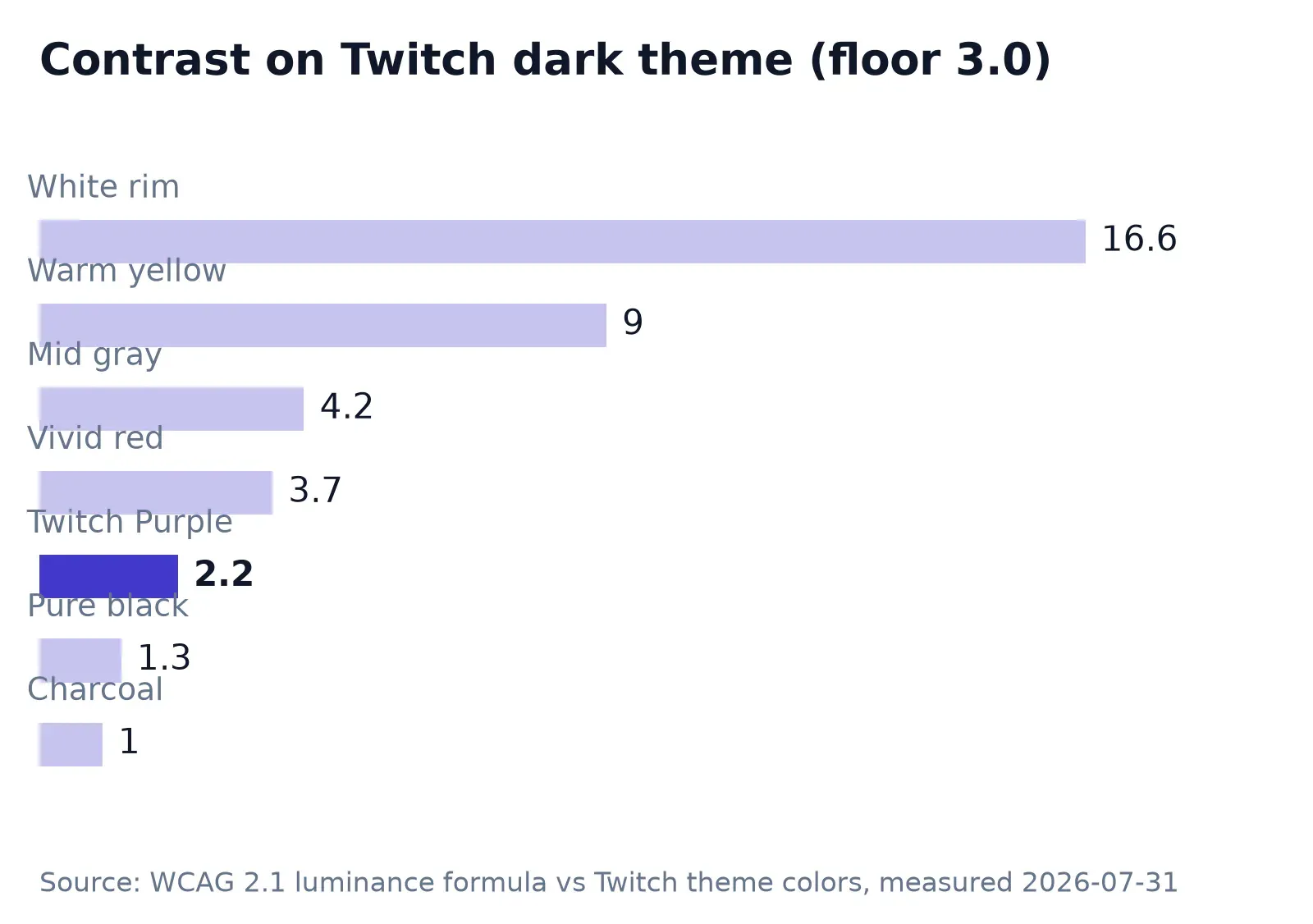
Pure black scores 21:1 on the light theme and 1.26:1 on dark. The charcoal I tested (#232127, a common logo background) is worse at 1.04:1, which in practice means the shape dissolves into the page. The finding that surprised me: Twitch Purple itself, #6441A4, measures 2.24:1 against the dark theme. The brand’s flagship color fails the contrast floor on the brand’s own dark surface.
The trap runs in both directions. A warm yellow measured 9.01:1 on dark mode and only 1.85:1 on white, so an avatar tuned for one theme can quietly fail the other. Mid gray was the only sample passing both, at 4.21:1 and 3.95:1, and I’ve never met a streamer who wants a gray brand.
The practical fix costs one layer: a light rim around the subject. White measured 16.63:1 against the dark background, so even a thin ring keeps the silhouette readable there, while the dark interior keeps holding its own on white. Logos with strong counter-forms survive this treatment better than photos, since the ring hugs a clean edge instead of stray hair.
Crop for the circle before you upload
A circle keeps roughly 78% of the square’s area, and the missing 22% is all corner. Anything you park there is gone. Center the subject, leave breathing room, and treat the outer edge as disposable, the same framing that makes a GitHub avatar survive the circle without losing letterforms.
For a photo, that’s usually enough. For a logo, check the fit against the actual mask before committing, not after. The same rules I laid out for keeping a logo inside Discord’s circle apply on Twitch, and the measured numbers above tell you which fill colors survive the darker stage.
Busy backgrounds compound the contrast problem, because a cluttered edge reads as noise at thumbnail size. Cut the clutter with RoundCut’s background remover and drop a flat fill behind the subject, picking a fill color from the passing side of the chart above. Everything happens in the browser, so the headshot never leaves your device.
Last step, dimensions. If the crop came out at some odd size, run it through RoundCut Resize to exactly 800×800 before uploading (which clears every floor in the spec table with room to spare) and let Twitch handle the downscale from there.
Logos, GIFs, and the banner next door
Moda’s guide makes one point I agree with and one I’d amend. The good one: a logo or illustrated avatar holds up better than a photograph at small sizes, because a viewer recognizes a strong shape long after fine detail is gone. The amendment: their advice to design at 512 and export at 256 undersells your source file. Design big, export 800, and the downscale is Twitch’s problem.
GIFs are accepted under the same 10 MB cap, which is generous for an avatar. Whether animation helps a tiny circle is a different question, and my answer is usually no: motion you can barely see is motion wasted.
One asset this post deliberately skips: the wide 1200×480 banner across the top of your channel is a separate upload with its own rules, per Hexeum’s spec list. The avatar advice here transfers only partially, since banners live rectangular. If your mark needs transparent edges for other placements, sort that out once with a transparent logo crop and keep the master file.
Of the seven colors I measured, the only one that passed both Twitch themes without help was mid gray, and a gray avatar excites nobody. Keep your brand color, add the light ring, and shrink the preview to thumbnail size before you commit. The same discipline carries to Bluesky and every other platform that hides a circle inside your square. This guide covers the Bluesky side.


